


Range Bound Trading Continues
We like to apply our technical trading knowledge over long, long periods of time. Time is a technical chartist’s greatest ally.
Speaking of time…
On December 25th, the world’s scientific community got a long-awaited Xmas present with the launch of the $10 billion James Webb Space Telescope that will peer into the deep reaches of the universe.
Science is often defined by space and time; that is why much of science lies just beyond the grasp of man’s understanding of it. There is hope that this powerful telescope will help explain the origins of our galaxy when it becomes operational in about one month.
Now we turn our attention to the 50-year weekly chart for the $USD:
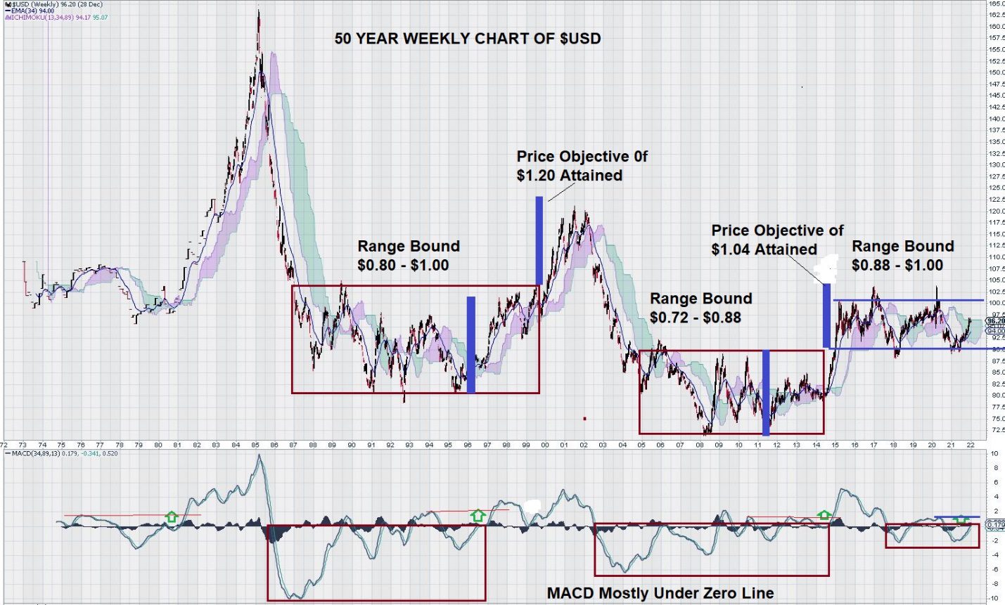
It is remarkable how a very long-term chart gives the clarity necessary to make unseen observations in a shorter duration.
Here we see that since the mid-1980s, the $USD has established several “box-range” trading patterns. First, note how the range (height of the box) has consistently shrunk. Second, in the first two “box ranges,” MACD remained under the zero line for almost the entire time price remained constrained by the box range. This is interesting to consider because the current box range has shown MACD to be under the box range for about ½ the time as the previous ones.
What does it all mean?
This chart tells us not to expect any significant changes in the $USD until it has several successive closes nominally above the $1.00 level or below $0.88. As this is written, MACD looks quite positive as the signal line is above the trigger line, and both lines are trending upwards at the zero line. This is considered necessary for the $USD to continue to advance.
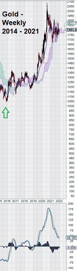 One other important observation to be made: Gold commenced its rally at about the same time as the $USD entered into its most recent box range trading pattern.
Taken together, these two charts suggest more “sideways” trading for both the $USD and gold until the current compact box range pattern for the $USD is resolved – either breaking out and up or breaking down.
The steep decline of MACD for gold without a corresponding decline for gold (gold has declined about 10%) indicates that gold may be storing up “trading energy” for another move up – after the $USD breaks lower.
Interpretation of charts using technical analysis means that you can’t “pick and choose” those indicators on time frames that fit your biased narrative. For this reason, we remind our readers that we have come to rely on signals that result from consecutive closes below the Ichimoku Cloud. This single observation yielded useful information about future trade direction when it occurred back in 2012 for the TSX Global Gold Index. Both the $USD and Gold are near key Ichimoku Cloud levels, and we continue to monitor them carefully.
Summary and Wrap-Up
The financial buzzwords that took us to the end of 2021 were: COVID and Inflation. The end of 2022 seems very distant from today. There is a collective expectation that a more normalized global economic setting will change these topics.
Our weekly chart for the $USD reveals that the first box range lasted over 14 years, the second about ten years, and the current one so far has lasted seven years. The current box range is the one that is most constrained. We could interpret this to mean that the $USD value has become somewhat “fixed.”
In the global economy, China has emerged as a power (some might say: “The Power”). The global economy cannot exist without trade. Geopolitical agendas can conflict with economic ones, leading to trade sanctions.
The US has a preferred position in world trade due to the reliance on the $USD as a reserve currency. It is still used to settle trade between many countries other than the US.
Perhaps the USA has used up its last “good faith token” at the trading table. The massive increase in the FED balance sheet may help explain why the narrow trading range for the $USD exists. Its value has been defined, and there is little room for significant improvement.
Gold and the $USD have a long-established link of trading inversely to each other. Based on this, a good trading strategy would be to continue slowly accumulating gold and gold stocks on weakness and simply await the signal from the $USD weekly chart. Once this is evident, there is a higher confidence level to increase your position.
The recent run-up in the gold price from the $1100 level to over $2000 feels like gold “playing catch-up .”We make this observation because the improvement in the gold price occurred as the $USD was establishing its latest narrow trading range.
In other words, gold improved, but the $USD did not “break down” – it simply traded sideways.
The fate of gold continues to rest with the $USD. Gold investors have weathered a 20-year drought from 1980 to the early 2000s. They also saw gold trade sideways for another six years between 2013 and 2019 before rising again.
So far, gold has declined around 10 % in the past two years. From a historical trading perspective, this is acceptable.
The USD is currently showing some short-term strength. This is constrained within its trading range.
Currency traders are hyper-focused on the $USD, but not so much on gold.
In 2022, it might be a good idea for commodities traders and gold investors to take the currency desk out to lunch a few times during the year – it might be worth it!
– John Top, the technical trader