
Positive Chart Pattern for Mirasol Resources
We nailed it twice with our 3 Taps and Out Trader's addage. Now, we're seeing the same chart pattern emerge from Mirasol Resources (TSX-V:MRZ)(OTC:MRZLF).
Oct 6, 2020 · 4 minute read

Category
Browse articles about Stock Charts on Equedia. Stay informed with expert analysis and insights.
We nailed it twice with our 3 Taps and Out Trader's addage. Now, we're seeing the same chart pattern emerge from Mirasol Resources (TSX-V:MRZ)(OTC:MRZLF).
Oct 6, 2020 · 4 minute read
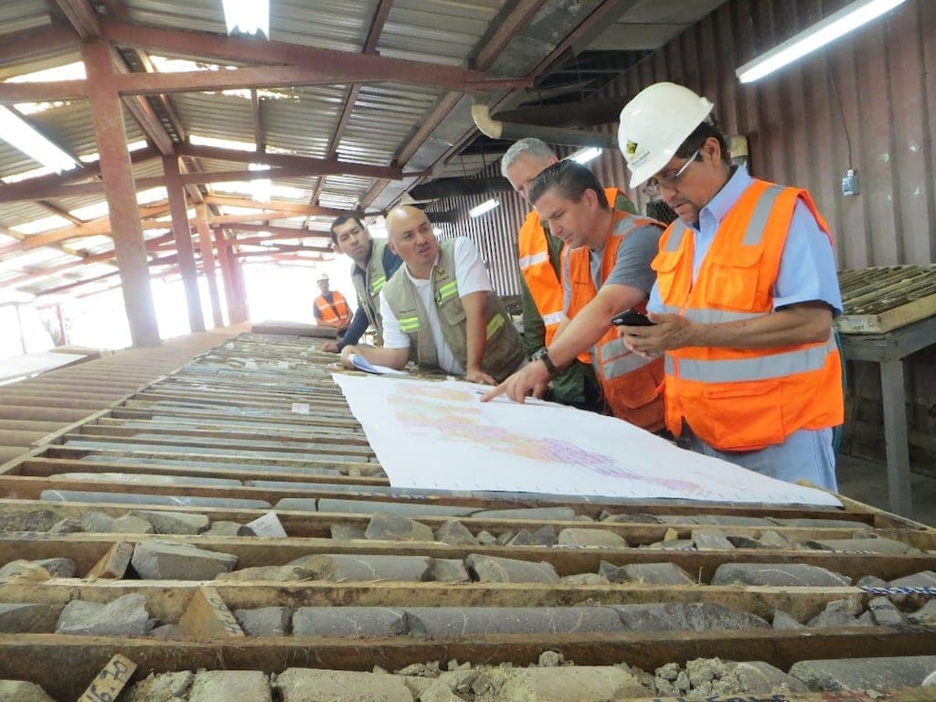
How Calibre Mining management team continues to deliver on a winning corporate strategy, with analysts cheering the gold producer's results.
Sep 17, 2020 · 3 minute read
We have identified the correct “signal" for copper. Now, we must wait for it to confirm that copper, like gold stocks, is on its way to test old highs.
Sep 16, 2020 · 2 minute read

When this stock chart pattern emerges, it could mean big rewards. It is a well-worn traders' adage that we highlighted back in February of this year.
Sep 4, 2020 · 2 minute read

Recently all eyes have been on gold. But what about copper? Here is a breakdown of the key level of copper, as well as a bellwether stock for the sector.
Sep 2, 2020 · 3 minute read

Calibre Mining Corp. (TSX: CXB; OTCQX: CXBMF) recently released its multi-year production and cost outlook for the next decade.
Aug 21, 2020 · 4 minute read

The merger of RandGold and Barrick Gold was announced in September 2018 and took effect at the start of 2019. So let's take a look back at what was promised and what was delivered.
Aug 11, 2020 · 3 minute read

Based on this chart, THIS is the long-term gold price target that we expect to see. Don't let this once in a lifetime opportunity pass you by!
Jul 31, 2020 · 3 minute read
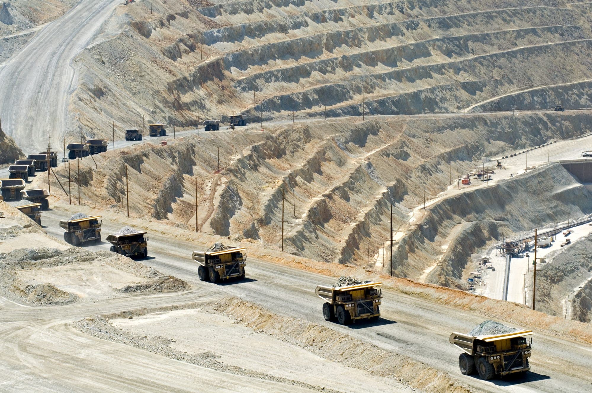
Jul 24, 2020 · 3 minute read

The Baltic Dry Index (BDI) is used to forecast the likelihood of future economic activity. So what is the Baltic Dry Index chart telling us now?
Jun 3, 2020 · 3 minute read

Evrim Resources Corp., EVM.V, a prospect generator, shows it can “bounce back” from a market set-back. Here's a look at the chart for Evrim Resources.
May 24, 2020 · 3 minute read

We made a good call on the S&P TSX Global Gold Index. Now we're seeing a similar pattern emerge in GDXJ, a junior gold ETF. Here's our chart analysis.
May 15, 2020 · 3 minute read

We take a close look at the technical chart for Wallbridge Mining (WM.TO) to see how it behaves after it fails to find support at a key long term internal support/resistance level. Then, we show you why and how it became a winning trade.
May 14, 2020 · 3 minute read

We will look at the weekly chart for copper and examine the True Strength Index (TSI). What the TSI and why it is useful when analyzing the longer-term weekly chart for copper?
May 10, 2020 · 3 minute read

The Dow Jones has penetrated support at the base of the Ichimoku Cloud, despite a lack of selling. So let's take a look at a few other major stock market indices to see if their charts indicate a similar lack of participation by sellers and what that might mean.
Apr 29, 2020 · 3 minute read

Will retail investors or pro traders come out on top after the world's first global economic shutdown? We take a deeper dive into who has the better strategy.
Apr 25, 2020 · 5 minute read

Mar 30, 2020 · 4 minute read

Here's the simple truth on COVID-19 and what it means for the stock market. We make a bold prediction on how to invest through the coronavirus pandemic.
Mar 15, 2020 · 6 minute read